NINA at The Original Art!
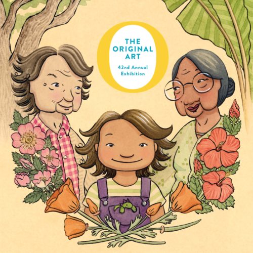
Fab news, NANA, NENEK & NINA was selected to be in the Society of Illustrators 2022 Original Art show! Thanks so much to the Society and the show jury, and an excited high-five to team NINA–Dana Chidiac, Cerise Steel, Rosie Ahmed; all at Dial; my agent Kurestin Armada at Root Literary; and my wise critique group, Diana Toledano, Isabella Kung, and Kerri Mcdermott. Finally, a big congrats to everyone else who’ll be in the show too–if their timeline was the same as mine, it means we all held it together during the first wobbly pandemic year to make these books. Oof. I’m going to try to go to New York for the reception to either celebrate or commiserate about trembly lonely pandemic book illustrating. Please say hi if you see me lurking by the snack table. 🤓
🤸🖼️🤸
I made a stop at the Society building once ages ago and it’s wild to think I’ll get to put a painting up there with so many amazing illustrators. Also, I heard that the show was originally started by Dilys Evans, who worked with Trina Schart Hyman (a foundational illustration crush of mine) on Cricket. Eek!
the dressmaker
fascinating fashion movie!
hugo weaving exits the house with a piece of fuchsia italian silk to the sound of the flower duet in lakmé:
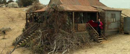
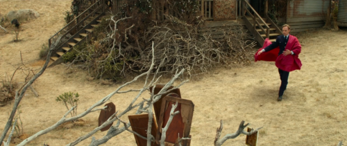
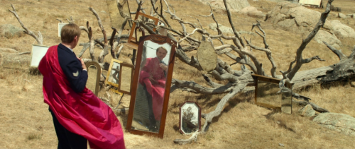
fine frocks in the dusty outback town of dungatar:
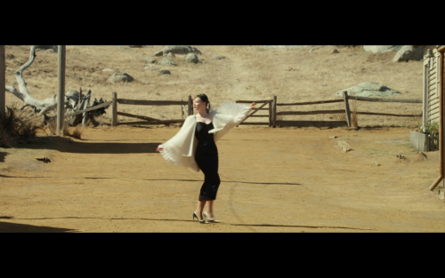
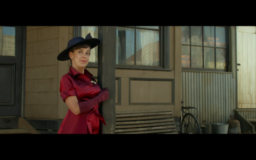
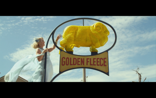
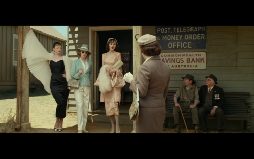
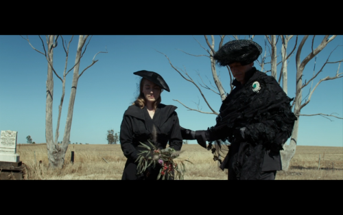
kate winslet and hugo weaving looking fab at a funeral:
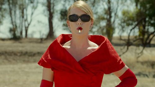
the red dress:
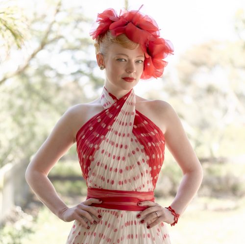
gert stole my wedding fascinator:
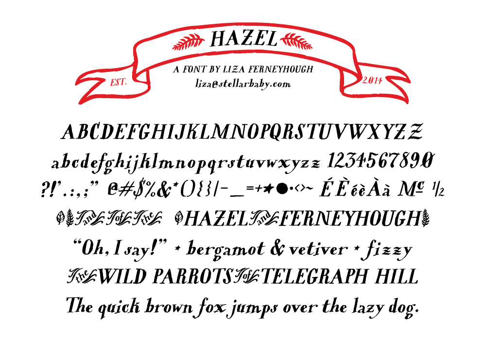
hazel
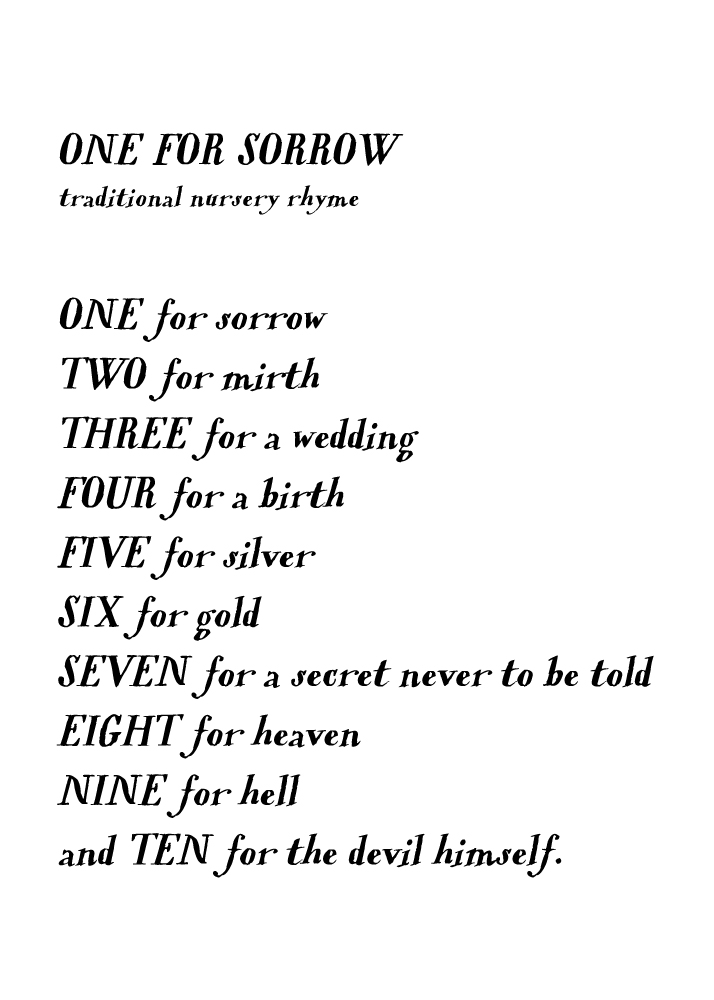
Introducing Hazel, a hobbitish semibold italic serif font that I hand drew with a hawk quill nib. For sale on my etsy page for personal use (email me to set up a commercial license). Enjoy! Send me a jpeg if you make anything lovely with it.
Special features: There are some fancy Zs in place of straight brackets (which come in very handy for a Liza living with one Mr. Hazel, but probably not for anyone else), a ribbony banner, a hazel leaf and a fern frond, a full moon and a star, a swooshy definite article and two prepositions. I think it looks especially lovely in all caps, and Goreyesque in the lowercase.
Hazel is a dab hand at the unattributed creepy old poem:
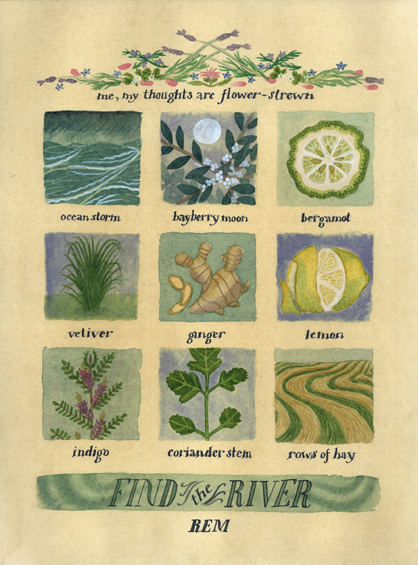
In its original, pre-digitized form:
formative books
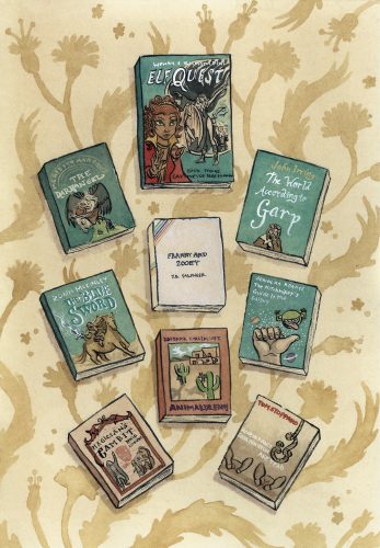
Books I loved in my ancient long-ago teenagerhood: the Elfquest graphic novel series (this particular one is book three: Captives of Blue Mountain, by Wendy and Richard Pini); The Darkangel, Meredith Ann Pierce; The World According to Garp, John Irving; The Blue Sword, Robin McKinley; Franny and Zooey, JD Salinger; The Hitchhiker’s Guide to the Galaxy, Douglas Adams; The Belgariad series, book three: Magician’s Gambit, David Eddings; Animal Dreams, Barbara Kingsolver; Rosencrantz and Guildenstern Are Dead, Tom Stoppard.
arnold lobel show
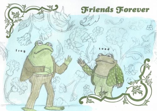
really liked the arnold lobel show at the contemporary jewish museum! he made everything 1:1 so they were mostly pretty tiny, like stuff i used to do for kids’ magazines. they had some of his color separations up too, totally fascinating and upsetting at the same time. i read trina schart hyman said color separations made her wild with rage and nearly blind. i’m so glad i never had to learn how to do that. a couple sweet things about the show was what it sounded like. people going around would read the text or see toad in a saggy 20s swimming costume and have a laugh. also, the show next door had a grand piano set up and somebody was practicing a waltz. so it was all soft chuckling and short echoey bursts of dreamy piano. the last nice thing was they had a table set up with blank postcards so you could write to a friend. i think i’ll send mine to my little pal bridget, we read a lot of frog & toad together! (i drew the background while studying the cover of mouse soup)
neil armstrong walking on my face
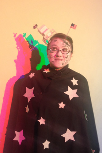
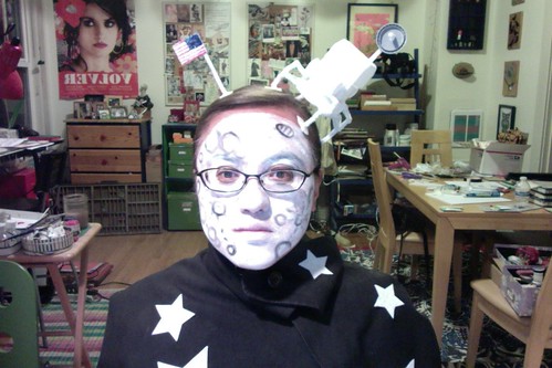
happy halloween! i was the moon.
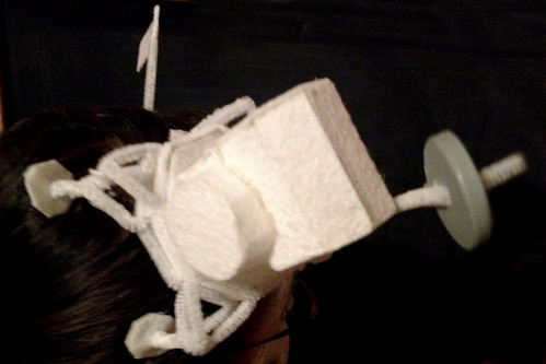
all i had to do was construct a lunar lander out of felt. simple!
hmmm… maybe not so simple. the explosion on the table in my studio tells the real tale.
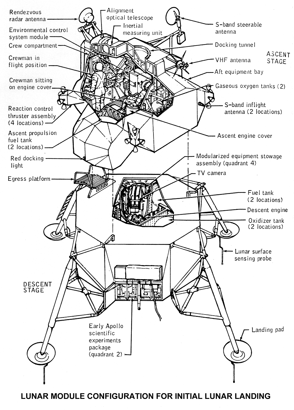
it comes together fairly quickly once you figure out the bottom half is an octagon and if you can emotionally accept just gluing together a mishmash of three dimensional shapes for the top half instead of following the real diagram.
twiggy, buggy wedding invitations
i submitted a couple designs for judgement to the minted wedding design challenge:
TWIGS
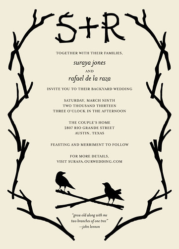
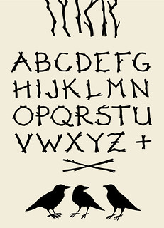
a stark, twiggy invitation perfect for an outdoor wedding in a wooded setting, featuring hand-lettered initials and a pair of flirty birds. there’s a john lennon quote at the very bottom from “grow old with me,” a song that makes me straight up bawl.
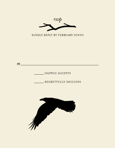
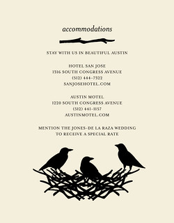
…and an rsvp and accommodations card.
DAMASK MEADOW
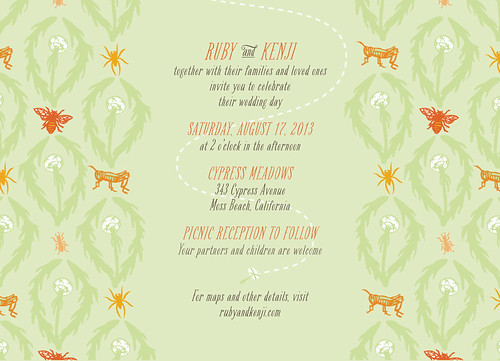
a springtime meadow-themed storybook wedding invitation featuring your favorite creepy crawly outdoor denizens in a Victorian damask pattern. heh, everything my young man hates about hanging out in nature!
PS:
Filed under digital, illustration, Uncategorized | Tags: design | Comments Off on twiggy, buggy wedding invitations
